The Beauty of Neutrals: Creating Warm and Timeless Interiors
Master the art of sophisticated neutral design through thoughtful layering, texture, and contrast.
Neutral interiors have long been associated with elegance, simplicity, and timeless design. While some people worry that decorating with neutrals can feel boring or flat, the truth is that when used thoughtfully, neutral palettes create some of the most sophisticated and welcoming spaces in a home.
The key to working successfully with neutrals is understanding that neutral design is not about the absence of color—it is about the careful layering of tones, textures, contrast, and balance.
Start with a Warm Foundation
One of the most important decisions when designing with neutrals is choosing the right base tone. Neutrals can lean warm or cool, and mixing undertones without intention can make a room feel disconnected. Warm beiges, creamy whites, soft taupes, and muted greiges create an inviting atmosphere that feels comfortable rather than stark.
Walls, large furniture pieces, and flooring typically establish the foundation. When these elements harmonize in tone, the space immediately feels cohesive and calming.
Layer Tones Instead of Matching Everything
A common mistake in neutral decorating is trying to match everything too closely. True depth comes from layering different shades within the same color family. For example, pairing a creamy sofa with deeper beige accents or soft tan textiles creates subtle visual movement.
This variation keeps the room interesting without overwhelming the eye. The goal is a curated look that feels effortless yet intentional.
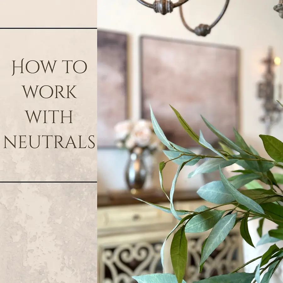
Introduce Texture for Visual Interest
Texture is essential in a a neutral space. Without it, even the most beautiful palette can feel flat. Incorporating materials such as wood, linen, ceramics, metal, greenery, and woven elements adds richness and dimension.
A textured console, sculptural accessories, soft florals, or natural foliage can instantly elevate a neutral setting. These details bring life to the room while maintaining a serene aesthetic.
Use Contrast to Define the Space
Contrast is what gives a neutral room structure. This does not mean introducing bold color—rather, it means thoughtfully balancing light and dark elements. A darker piece of furniture, framed artwork, or metal lighting can anchor a space and create a focal point.
Even subtle contrast, such as matte finishes paired with reflective surfaces, adds sophistication and prevents the design from feeling one-note.
Keep Styling Intentional and Uncluttered
Neutral spaces thrive on thoughtful styling. Instead of filling every surface, choose meaningful accessories that contribute to the overall mood. A simple floral arrangement, layered artwork, or a sculptural object can make a stronger impact than multiple small items competing for attention.
Editing is just as important as decorating. Allowing the eye to rest is part of what makes neutral interiors feel luxurious and peaceful.
The Lasting Appeal of Neutral Design
Neutral decorating is timeless because it creates a backdrop for everyday living. These spaces feel refined yet approachable, styled yet comfortable. When tones are layered, textures are varied, and contrast is balanced, neutrals become anything but boring—they become a statement of quiet confidence and enduring style.